Contribute to the DSpace Development Fund
The newly established DSpace Development Fund supports the development of new features prioritized by DSpace Governance. For a list of planned features see the fund wiki page.
The concepts here presented are largely inspired by the navigation patterns and functionalities available in JIRA (one of the most successful trouble ticketing system also used to manage the DSpace project) and Zotero (an easy-to-use well known research tools to collect and organize research outputs).
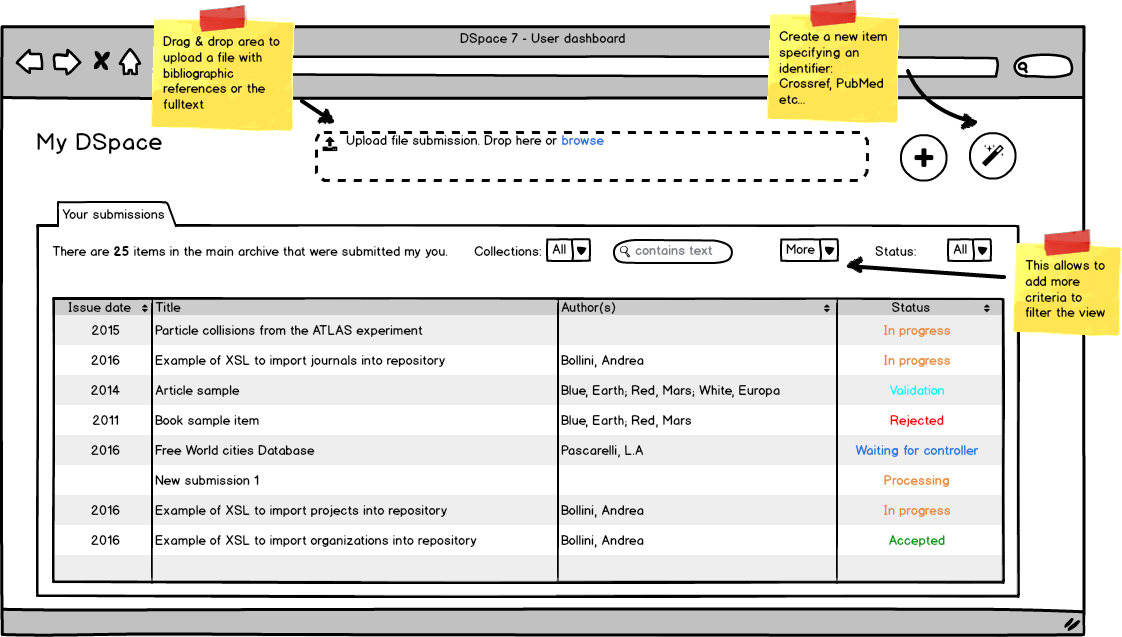
Any registered user has access to a Dashboard from where all the actions related to new content and profile management can be performed. Depending on his role, the user will see one or more tabs related to content. The submitter role has a simple tab “Your submissions” where he has a full overview of his submissions, current and past. From here it’s possible to start a new submission (see the Submission wizard section) or complete and check the statuses of previous started submissions.
The following functionalities will be provided:
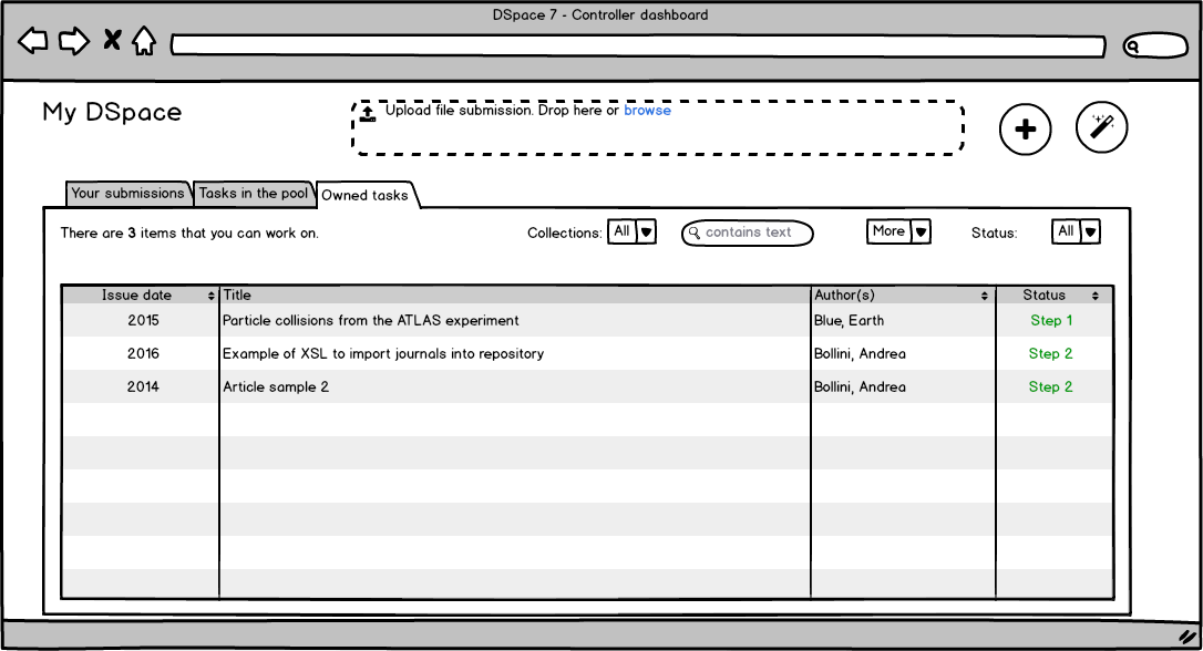
(priority 1) separate tabs for "my submissions", "available tasks", "my tasks"
(priority 1) ability to filter, search and sort the content by several criteria (collections, workflow status, submitter) - this is related to the use case: Admin UI - Workflow tasks can be filtered and sorted
(priority 2) ability to filter for a specific metadata value or textual search - depends on the acceptance of a new SOLR core for inprogress submission - this is related to the use case: Admin UI - Workflow tasks can be filtered and sorted
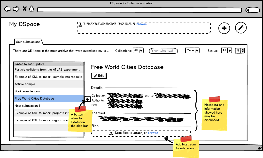
(priority 2) ability to switch between a tabular view and a detailed view, see Figure 3
(priority 3) ability to set which columns include in the tabular layout via configuration - this is related to the use case: Admin UI - Workflow tasks can be filtered and sorted
(priority 4) change the configuration from the UI on a per user base - this is related to the use case: Admin UI - Workflow tasks can be filtered and sorted
Macro changes required to the DSpace architecture
(priority 2) in progress submissions need to be index in SOLR. We propose to create a separate SOLR core twin of the search core in order to be able to search across both cores when appropriate (i.e. for administrative UI) using the distribute solr query or the SolrCloud shards concept if SOLR will be updated. Having a separate index/core/shard for inprogress submission will assure that frequent updates will not disturb the public search
MOCKUPs
If you want propose changes to these mockups please add a comment in this page referencing to your own version of the mockups. The editable version of the mockup are linked just below each images. Clone the mockup page, make your own change editing the page and the balsamiq mockup and don't forget to link to your proposal in your comment!
- submitter Dashboard

Submitter dashboard (editable version)
MyDSpace Detail view (editable mockup)
- admin Dashboard
MyDSpace admin dashboard 1 (editable mockup)
MyDSpace admin dashboard 2 (editable mockup)
Overview
Content Tools
All content on the LYRASIS Wiki is licensed under the CC BY (Attribution) license![]() , unless otherwise noted.
, unless otherwise noted.
24 Comments
Art Lowel (Atmire)
I like the idea to have live search and filtering on the mydspace page.
I also think it's a good idea to start your submission by dropping a file instead of forcing people to fill in a bunch of metadata first.
But a few things are unclear to me at the moment:
I'm also worried about the feasibility of the design on smaller screens:
Andrea Bollini (4Science)
magic wand: it comes from zotero so we expect that many researchers will be already familiar with that. Anyway we also are not completely happy with the icon... we plan to add a pop-up tip on mouseover to say import using an identifier. Clicking on it will open a dialog to input an identifier (doi, arxiv, etc.) and start the submission (see the zotero documentation on that)
more dropdown: the available options depend on the acceptance of the use of SOLR to index inprogress submission (see required macro change). If we need to stay on the database only filters based on the last modification date, creation date and submitter could be implemented. If we go with SOLR we can use any filter configured in discovery.
dropdown containing 5: nice catch it is something left around
icon next to the author names: it is not relevant for this functionality and should be ignored. It means that the metadatavalue has an authority but it makes sense to show the icon only if we can link it to something, so until we reach an agreement on author profile, additional entities, etc. we should remove it from the mockup
detail view: in our idea it is almost the same for the submitter, for submission sitting in the pool and for owned task. Only the action buttons should be different. Replying also to the Monika Mevenkamp comment, we propose to have a separate backend detail view than the public view because when an user access an item from the backend they have completely different use cases than public user. On the backend they want to check the details, the status and many "administrative" information (such as feedback from the workflow validator, etc.) on the public frontend we expect a much fleshy and "publisher-like" layout. Having a separate view give much more control and flexibility
contains text: it depends again on the use of SOLR or not. If we use SOLR it can search in every metadata, if we need to rely on the database we should consider
sorting by title: you are right the title column should be sortable. It is the author column (as there are repeatable values) that could be eventually not sortable (or we can sort for the first author but I don't thing it is very useful)
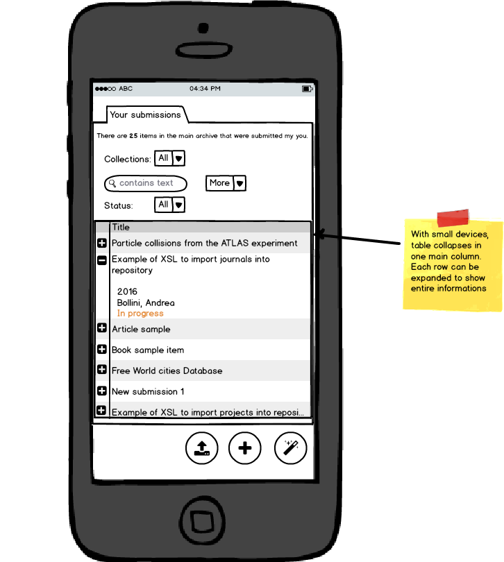
detail view on mobile: at this time we are working on the mockup without worrying too much about "technical limitation" or implementation costs. We should revise the plan early in the development if we face with any blocking or costly issue. On mobile it will be nice if the side navigation menu collapse automatically in a small clip. If reopened clicking on the clip only the list of publications should be seen.
Art Lowel (Atmire)
magic wand: Would it be possible to show a preview of the metadata you're pulling in from 3d party sources before starting the submission? This seems especially useful if there could be multiple sources that can provide metadata for the same identifier and you have to decide which one to choose.
detail view on mobile: In my experience a lot of potential problems with mobile devices can be prevented if you think about how the design will work on multiple screen sizes as early as possible in the process. That way you'll start from UI elements that work well, and position blocks of content in a way that scales, and you won't require many ad hoc fixes to make it work on a small screen later on.
Andrea Bollini (4Science)
Currently when you configure multiple providers able to manage the same identifier (for example the DOI) the providers are queried in sequence. A provider can add information only if no previous providers have already supplied such information (metadata). The user is not allowed to decide from which provider take the "title" or other metadata.
From a practical point of view there will be very rare case of conflicting metadata between reliable providers. Furthermore, I remember that it was possible to define the priority of the providers but I don't find any evidence of that in the source code so this could be eventually an area of improvement with minimal effort. Instead add an user interaction will make the functionality much more complex and will bring to the need of additional services for instance to get the detailed preview data. For the first implementation we prefer to stay close to the current functionality
Monika Mevenkamp
I created an alternate MOckuo of a Submission Dashboard
see Submission Dashboard
I agree that JIRA as a great UI and I tried to hew closely to it.
In my mind there are three main views in DSpace:
The list view and detail view functionality for logged in users is conceptually the same as search and browse functionality offered to site visitors. In both cases users define filters that collect 'interesting' items and then they view the details of the 'really interesting' items.
To me submission is a distinct activity which should be handled in its own view. This is why I removed any reference to submission from the Dashboard pages main body. JIRA has a CREATE button in its header. My mockup suggesst to add a 'Submit New' button to a drop down menu in the header for logged in users.
I agree with Art: uploading a file first in the hope that some metadata can be scraped would be great. But the magic needs to be explained. Bering less rigid about the order of submission steps than current interfaces would be helpful as well.
While I doubt that anyone would do any serious admin/submission work on a phone making the interface work well on a small laptop screen should definitely be a goal. Additionally - less clutter is always better.
Andrea Bollini (4Science)
One of the overall goal of our proposal is to minimize the deposit effort making the process as fast and easy as possible. This also include reducing the number of clicks that a researcher need to perform to start and complete a submission. JIRA doesn't have "alternative ways" to create an issue this is why IMHO they only provide a create button, but btw they put it in a prominent position so that you don't need to open a dropdown and click on an option (two clicks vs one click).
In Mendely for instance you have a create item, and on the dialog you have the option to decide between manual input the information or upload a file. In zotero you have immediately the same three options that we provide (file, identifier or manual input). Anyway, it should be just a design matter switch from our proposal to one botton or an option in the "user menu" assuming that the last two will open a dialog with the three options that we provide in the mockup.
As replied to the Art's comment the magic icon stay for import from identifier, the import using a bibliographic file or a pdf rely on pluggable framework able to "convert the file" in metadata. In the current DSpace version it is possible to import from RIS, EndNote, BibTeX we will add support from PDF integrating the grobid library. In any case the functionality will be build allowing to plug different implementation and libraries to support different formats.
I see useful notes and idea in your alternative mockup, thanks to provide it! I'm going to provide comment on it
I like the introduction of the refresh icon/functionality and the details about where to put additional (more) filters when enabled. Following the JIRA approach we should also consider to allow multiple value to be specified for our filters and use the tags approach to report about applied filters.
Monika Mevenkamp
a couple quick comments as I am ready to take off on vacation
I will be away for two and half weeks - it is a shame - otherwise I might have been able to get some UX input locally
to Andreas Comment - I did not realize this was supposed to be the design for administrators and all that they want to do and I agree burying CREATE Submission in a drop down somewhere up in the header is not such a good idea. I agree also that CREATE Submission should be easily accessible - I do think its acceptable to ask users to make a choice/click a button to reach a submission form. The trick will be to build a smooth submission experience and to make sure that in the final submission view, users are in the position to do whatever they want to do next - maybe do another similar submission / move the submission forward in the workflow. I am not sure what the average admin wants at the end of a submission.
I suggest to approach the Dashboard in steps
The difficulty will be in offering the right CHOICES and in building ACTION views that feel seamless to the user.
The CHOICE area should offer actions like - Create Submission, List Submissions, Account Management, ....
The ACTION area should then adapt to the choice taken
For example look at Amazon- they allow users to do lots and lots of complicated things. Users make their choice in a menu displayed below the top header bar. Depending on The main area may totally change depending on the user choice,
Regarding tabs to list different submissions 'My Tasks' , 'Available Tasks' , 'My Submissions': I believe this should be part of the available filter options. Maybe an Asignee/Task Owner option with values ''None' Anybody' 'me', 'specific users', 'another specific user' ... Maybe two options: Asigned checkbox. and an Asignee Choice with options 'Me', list of possible choices.
Andrea Bollini (4Science)
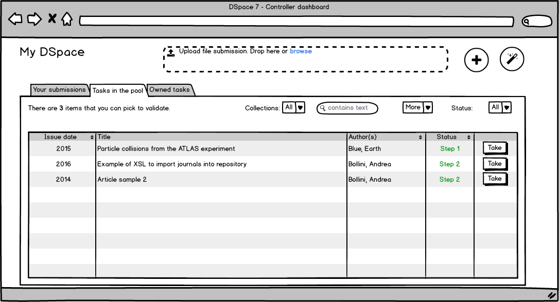
These mockups are related to the content management and apply to both "internal users" (aka submitters) than "workflow validators" (librarians, etc.). Administrators are often also involved in the workflow but this is not required.
We have started from the current MyDSpace concept that is close to be (but not really) a dashboard for the registered user. I like the idea to introduce a real "user dashboard" from where he can go in specific area (submission, user profile, registries, etc.), a new mockup for that will be helpful.
About the tabs for My Tasks, Available Tasks, My Submissions vs the use of filter to adapt a single view we prefer the tabs solution as these three views are the list of items that the users need to be have always under control. Of course it will be nice to save a view configuration (filters, sorting, etc) to create sever "ready-to-use" views but this is an extra functionality currently outside the scope of the Hasselt project and, I guess, the dspace7 resources constraint
Monika Mevenkamp
Back from vacation:
I am still not convinced that TABS add different functionality than filter options and therefor it seems to me, that they should be implemented through the same mechanism. The items in the My Tasks / Available Tasks / My Submissions TABS can just as easily be defined with filters. I expect that filtering functionality will either be implemented on the client side or results will be cached, so that switching between filters could be just as fast as switching between tabs.
I do not understand the rational for using a different visual element for these particular filters as opposed to filters that restrict to say destination collections. Using TABS makes it impossible to see all TASKS relating to a particular collection/community/author regardless of whether they are My Tasks/ Available Tasks, My Submissions.
I expect that admin users will want to see which tasks are taken by anybody, or taken by a particular staff member. Filtering would be a natural solution to offering this type of functionality and would mesh better with the overall design if not using TABs.
Tim Donohue
Just to briefly chime in here, in our recent DSpace 7 Working Group (2016-2023) meetings we discussed similar ideas. Currently, work on the backend of the MyDSpace functionality is proceeding, but we've delayed any front end UI development work. The reason why we've delayed the front end work is that we also suspect that the functionality presented here could be aligned with our new Search Mockup designs (which include similar facet/filter options that Monika talks about).
So, we are waiting for the Search work to progress, and then hope that we can use those same components to allow this Dashboard to act/look similar to the search UI (though with a few custom facets/filters based on what folks want to see/find in this dashboard). In general, reusuable UI components will not only bring more consistency to these designs, but also result in less code to maintain.
In the meantime, if anyone sees inspiration to provide alternative mockups, we'll still consider them. So, ideas are still welcome.
Jonathan Green
Possibly a bit more "functionality" rather than "UI" but on "admin dashboard 1", it would be good if (perhaps based on permissions) some editors/admins could (perhaps optionally via a toggle or filter at the top of the last column) see all tasks in the system (not just those still waiting to be taken from the pool). These "assigned/owned tasks" could be represented in the list by showing the current owner (Full Name - or maybe first name with full name on "hover", not sure how that would work with mobile?) of the task in the last column, in place of the "Take" button.
This would allow say, a senior editor to see who has which tasks. The problem scenario this tackles is that an editor may take a task and go off sick, in which case the senior editor may want to see what tasks that staff member has and perhaps reassign them to the pool for others to work on in their absence.
Related (but not UI): If I remember right, there is a situation at the moment (note we are on 5.3 at Nottingham so forgive me if this is fixed already) where a new editor cannot see tasks that were created before they became an editor. Here the problem scenario would be that work builds up say, and a new hire comes in to take on the work load and is given permissions to edit. They can't see any of the tasks in the pool though since all were created before they arrived. The work around is for an editor, who can see them, to move them all out of and back into the pool. Not practical if there are many tasks in the system.
Andrea Bollini (4Science)
You are right it is useful (and necessary) to have a place where administrators can see all the tasks regardless of their status. This is currently a functionality available in DSpace so we will need to include it also in DSpace 7. We can add an extra tab available only to the administrators where all the tasks in the system are listed with filter options. A reject action can be included. It will be nice to have a reassign action too but this is a new feature and I'm not sure that it can be implemented in DSpace 7.
The plan for DSpace 7 is to switch from the standard max 3 steps workflow to the advanced workflow, I'm not sure if the issue that your report about previous tasks not visible to new editors, that still affect DSpace, also apply to the advanced workflow.
Andrea Schweer
The configurable (advanced) workflow solves both these issues.
Jonathan Green
Ah great! Thanks for the responses both and the tips on switching to the advanced workflow.
Anton Angelo
The status field - would that be nameable? We often need to differentiate between items at the same step, but that have different needs: "Copyright permission requested", "waiting on PG office", "Brenda".
Andrea Bollini (4Science)
Unfortunately I don't think that this is something that we can do in DSpace 7. It will require some extension of the datamodel to be able to flag / annotate in some way a task or submission. Right now, you can create a custom metadata, make it editable only in the workflow and use this metadata to store such kind of information (or pick one value from a dropdown).
In the current DSpace < 7 you will need to customize the UI to show this metadata, in our proposal for DSpace 7 we plan to make configurable the list of metadata to show
Barbara Hirschmann
The main use case of this page for users of the repository (submitters) will be to upload new publications. The admin functionality is really only relevant for library staff.
Considering this, I have the impression that the "Upload new publication" feature is not prominent enough compared to the task dashboard. Looking at the mockup, my first sight goes to the tasks, not to the new publication section.
Andrea Bollini (4Science)
Submitters only have the My Submissions tab nor the tasks tabs. In the My Submissions tab the list of previous and inprogress submission is presented. Check the status of his submissions is also one of the main activities of a researcher when he login. Of course you are right as well and we should give prominence to the functionalities to input new content. Maybe we can just give more room to the drag&drop area and make the buttons larger? other ideas?
Do you like to have the "new content features" also when you switch to the tasks tabs or do you think it will be better to have them inside the "my submission tab"?
Andrea Schweer
I have long wondered why the review workflow functionality (admin/workflow perspective) and the start submission / check my own submissions' status functionality are on the same page in DSpace. It's my impression that most people would only ever do one or the other type of task, rarely both. Perhaps they should just go on separate pages in DSpace 7?
Barbara Hirschmann
I cannot really comment on the task features because we do not use them in our repository. But I would not lean towards integration "new submission" into "my submissions".
I tend to agree with Andrea that these are two separate use cases. I also like the suggestion of having a completely separate "new submission" page.
Àlex Magaz Graça
Will these mockups go through usability tests before they are implemented?
Andrea Bollini (4Science)
Unfortunately no. There are no resources available for that internally, it will be very helpful if UX experts can join the DSpace 7 working group. Support from institutions to conduct usability tests in the different phase of the implementation will be also highly appreciated.
Andrea Bollini (4Science)
To clarify: it is understood that we will work with the community listening feedback to improve the solution. The previous comment is intent to raise the attention about the need / opportunity to involve in more detail UX experts.
stuart yeates
The logic for 'My Submissions' is slightly wrong. It needs to be available if you have the submitter role OR if you have any past submissions. This covers people whose role changes and/or have legacy items in the system.