
VIVO Documentation
Old Release
This documentation relates to an old version of VIVO, version 1.10.x. Looking for another version? See all documentation.
The temporal graph is one of the standard visualizations provided by VIVO. It allows one to compare up to ten persons or organizations on a time axis. You can select if you want to compare by publications, or by grants.
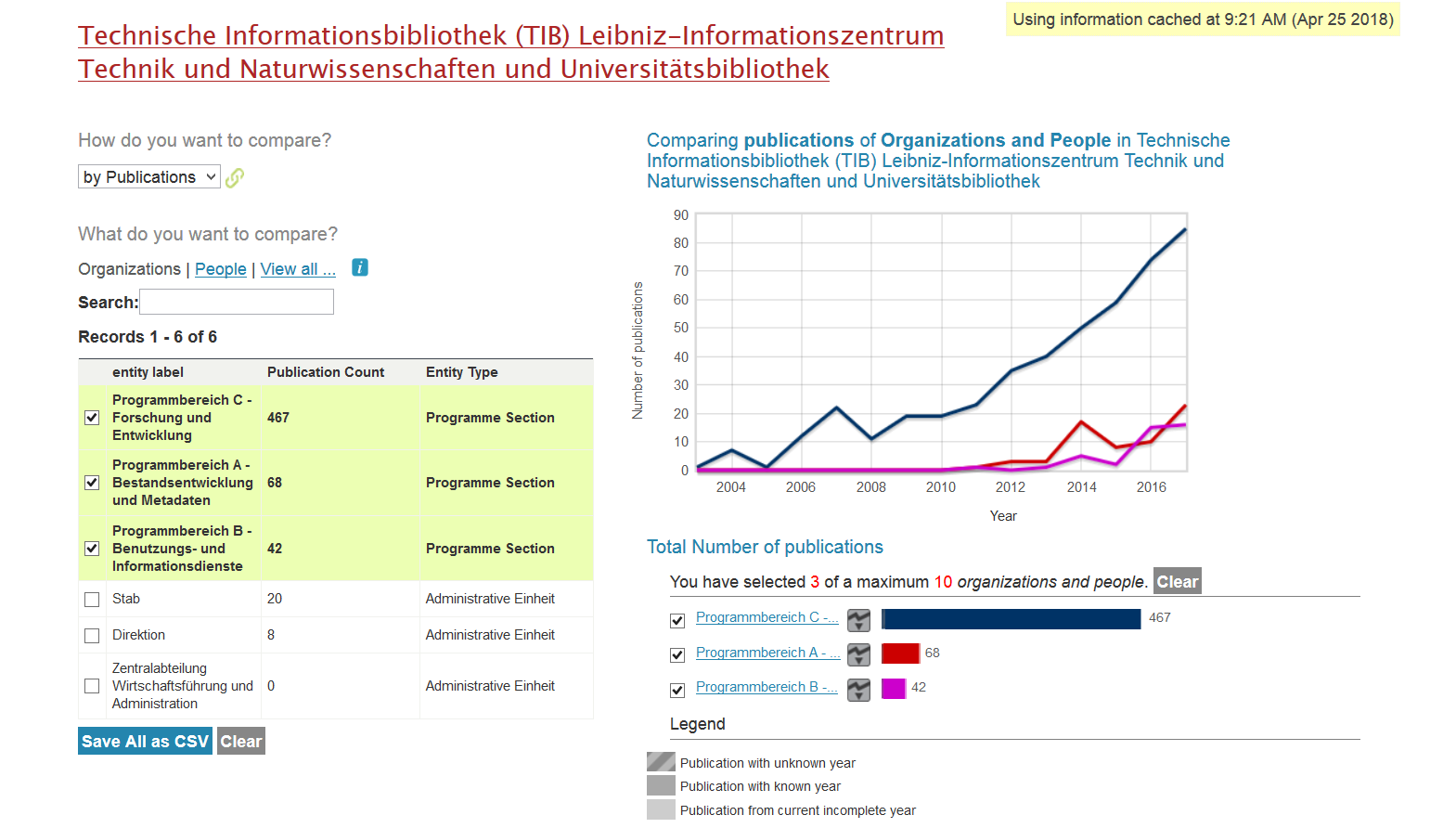
The name of the organization whose output is displayed is shown above the visualization. On the right side in a yellow box you can read when the information shown here was last updated. On the left side you can now set whether publications or grants should be compared with each other and whether these comparisons should refer to persons, organisations or both together. Only the ten entries at a time are displayed. Further entities can be added via search slot.
If an entity is added to the comparison, the output is visualized on the right side in the temporal graph. Under the display you can remove the selected entities individually or altogether ("clear all").
It is also possible to export the number and type of publications per person and entity ("Save All as CSV").
All content on the LYRASIS Wiki is licensed under the CC BY (Attribution) license![]() , unless otherwise noted.
, unless otherwise noted.