| Screen shot & Source URL | Individual observations | Joint community opinion |
|---|
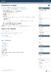
| Bram Luyten (Atmire) Main pane - News => KEEP
- Communities => I personally think they shouldn't be on the homepage. Too cumbersome if list is long
- Recently added
Right nav - Browse => IN DOUBT ... takes a lot of place, might be cleaner to hide this
- options to login => IN DOUBT ... not sure if this should be BOTH in the header and in the nav
- Discovery facets => IN DOUBT ... are they really useful on the homepage?
- Stats => NOT PROMINENT ENOUGH
- RSS
|
|
| Bram Luyten (Atmire) News => KEEP Community listing + Discover facets next to eachothers - => I personally think community list shouldn't be on the homepage. Too cumbersome if list is long
|
|
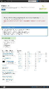
DSpace-CRIS out-of-box and typical "customization" 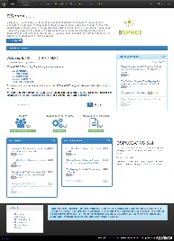 Image Added Image Added 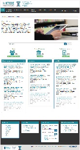 Image Added Image Added
https://dspace-cris.4science.it/ http://ktisis.cut.ac.cy/ | Andrea Bollini (4Science) - Removed the top community list by default
- More editable html section (head, side & footer)
- central role of the search
- Infographics about virtual aggregation of the repository content (in dspace-cris we have additional entities but it can be also a group by a custom solr query, dc.type, etc.)
- More "list of content": recent submission and most viewed, downloaded
- the navigation bar include links to virtual section of the repository
Typically insitutions use the html editable section to put - carousel of images / institutional news
- link to other general services (footer)
- often the central panel with the search box and infographics is enlarged to the full row and the additional side news section if used is put on a single middle row
|
|
| Bram Luyten (Atmire)
- Visually eye catching section that draws the user to recent/highlighted content
- In a DSpace context, this could be the thumbnails of recent items, or highlighted items/collections
- Search box that could also function to show the user the (top level) communities. The fact that the box does search "everywhere" by default, but allows you to drill down to a particular topic/community is very nice
- The SEARCH feature & listing of search results seems TOO LIGHT. Only sorting between relevance and name. No facets. I'm convinced we still need facets in DSpace search. Although there's something to say for simplicity as well.
| 2017 June 7 interesting but not enthusiastic about this viewer |
| Monika Mevenkamp simple but powerful works for all types of content and repos with mixed content. Princeton has for example no pretty images, lots of journal articles, ETDs, some datasets, ... low maintenance: no manual grooming of featured items - no worries that arithmetically chosen featured items step on anybodies feelings this will live and die with the SEARCH and Filter capabilities on the search results page - SEARCH could lead to a page that shows a list of results and offers categories to filter results; categories should be configurable: eg
- DataSet → show only dc.type = DataSet matches
- Department → show local.custom.department facet to select one or more choices
- in terms of filtering: draw inspiration from what Blacklight does - or look at WOS search page or ....
- the grid up top could lead to a hamburger style menu - collections, submission instructions, news, statistics, ....
- top right Login or User Logo
| 2017 June 7 would be a very good customizable option |
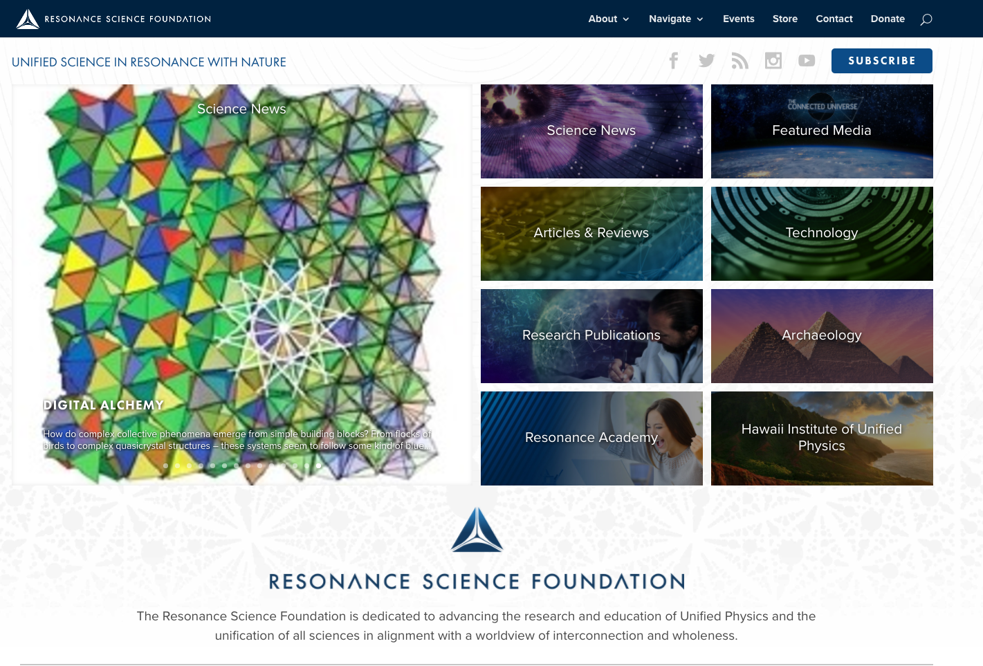
| Bram Luyten (Atmire) - CONTENT FIRST
- Left panel: emphasis on recent/highlighted items.
- Right panel: collections/communities/subjects
- BELOW: explanation about the system/repository
- NO SIDEBAR/Clutter left or right
- Focus on social in the top level bar
| 2017 June 7 like how it highlights new items like as an option, but not a default would like it customizable
|
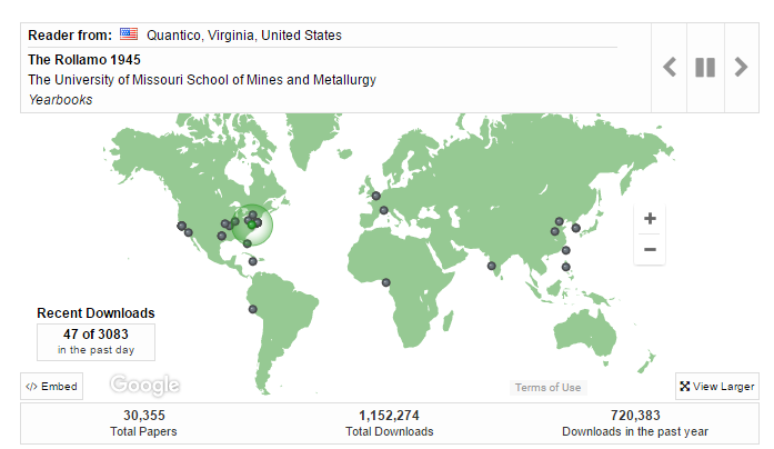
http://scholarsmine.mst.edu/ Digital Commons at Missouri University of Science and Technology | Felicity Dykas (Missouri) Dynamic map; dots appear to show items being downloaded. Eye-catching. Shows users (and administrators) that this is a site that is being used.
"This map shows recent readership activitiy ..." | 2017 June 7 homepage should be simple; useful to have option to add to selected pages; e.g., statistics view; make available for repository, community, collection, and items nice, interactive feature shows records being accessed would be of interest to faculty
|
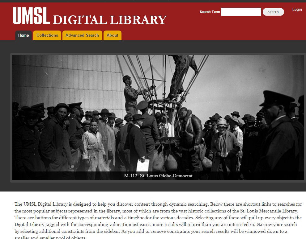
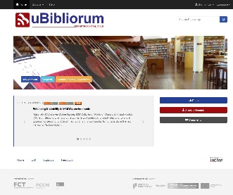
https://dl.mospace.umsystem.edu/umsl/ Islandora at University of Missouri–St. Louis | Felicity Dykas (Missouri) Slide show - as an option feature. Knowledge Bank at OSU has this feature: https://kb.osu.edu/dspace/
| 2017 June 6 Would like homepage design options that add appealing visuals |
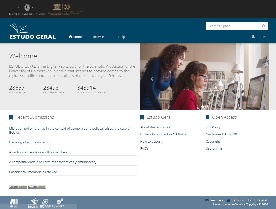
| Jose Carvalho Focus on institucional Repository context Image highlight, general stats, last deposits, administrative information regarding the repository use |
|
| Jose Carvalho Institutional repository with banner slideshow of the institution + action buttons to deposit, login,.. + information regarding policy, helpdesk... |
|