| Contributor | section | screen shot | url | annotation |
|---|
| homepage
search
browse/discovery
item pages | 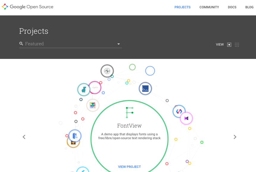
Homepage with animated "carousel" / "discovery thingy"
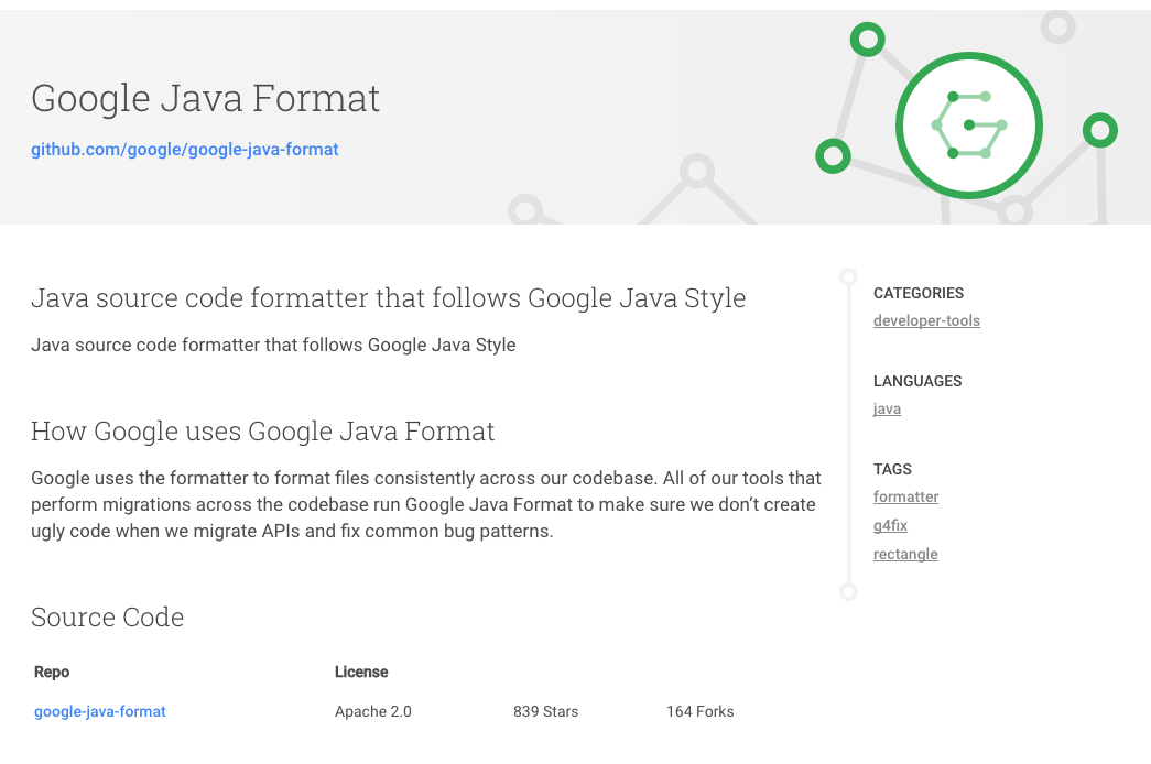
Example of an "item page" in this system
| https://opensource.google.com/projects/explore/featured | - Visually eye catching section that draws the user to recent/highlighted content
- In a DSpace context, this could be the thumbnails of recent items, or highlighted items/collections
- Search box that could also function to show the user the (top level) communities. The fact that the box does search "everywhere" by default, but allows you to drill down to a particular topic/community is very nice
- The SEARCH feature & listing of search results seems TOO LIGHT. Only sorting between relevance and name. No facets. I'm convinced we still need facets in DSpace search. Although there's something to say for simplicity as well.
- The item page equivalent seems a little "light". It's interesting that you lose all context of navigation, no breadcrumb etc. User is supposed to use the back button? It's very clean, but maybe too clean (e.g. sacrificing usability?)
- The fact that a single item can have its own header to make it more visual is really nice.
|
| homepage | | https://www.google.com/?gws_rd=ssl | simple but powerful works for all types of content and repos with mixed content. Princeton has for example no pretty images, lots of journal articles, ETDs, some datasets, ... low maintenance: no manual grooming of featured items - no worries that arithmetically chosen featured items step on anybodies feelings this will live and die with the SEARCH and Filter capabilities on the search results page - SEARCH could lead to a page that shows a list of results and offers categories to filter results; categories should be configurable: eg
- DataSet → show only dc.type = DataSet matches
- Department → show local.custom.department facet to select one or more choices
- in terms of filtering: draw inspiration from what Blacklight does - or look at WOS search page or ....
- the grid up top could lead to a hamburger style menu - collections, submission instructions, news, statistics, ....
- top right Login or User Logo
|
| homepage
| 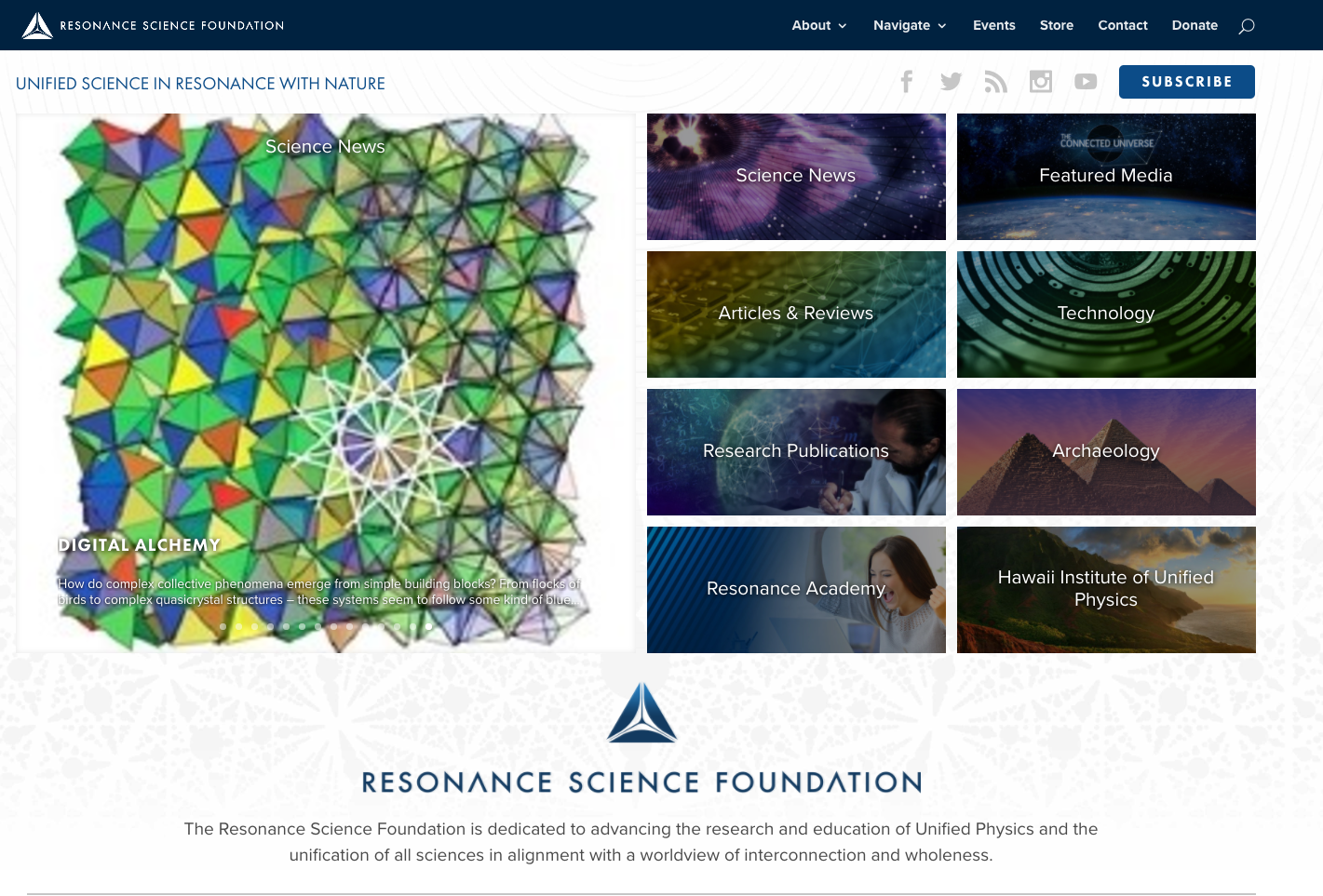 | https://resonance.is/ | - CONTENT FIRST
- Left panel: emphasis on recent/highlighted items.
- Right panel: collections/communities/subjects
- BELOW: explanation about the system/repository
- NO SIDEBAR/Clutter left or right
- Focus on social in the top level bar
|
| item listing | 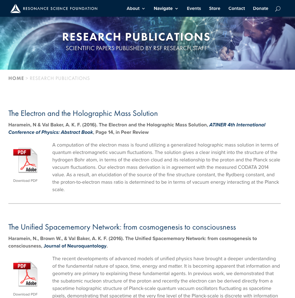 | https://resonance.is/research-publications/ | - Great on mobile
- Title, citation, abstract and PDF icon
- Nothing screams "download me" more than a PDF icon
|
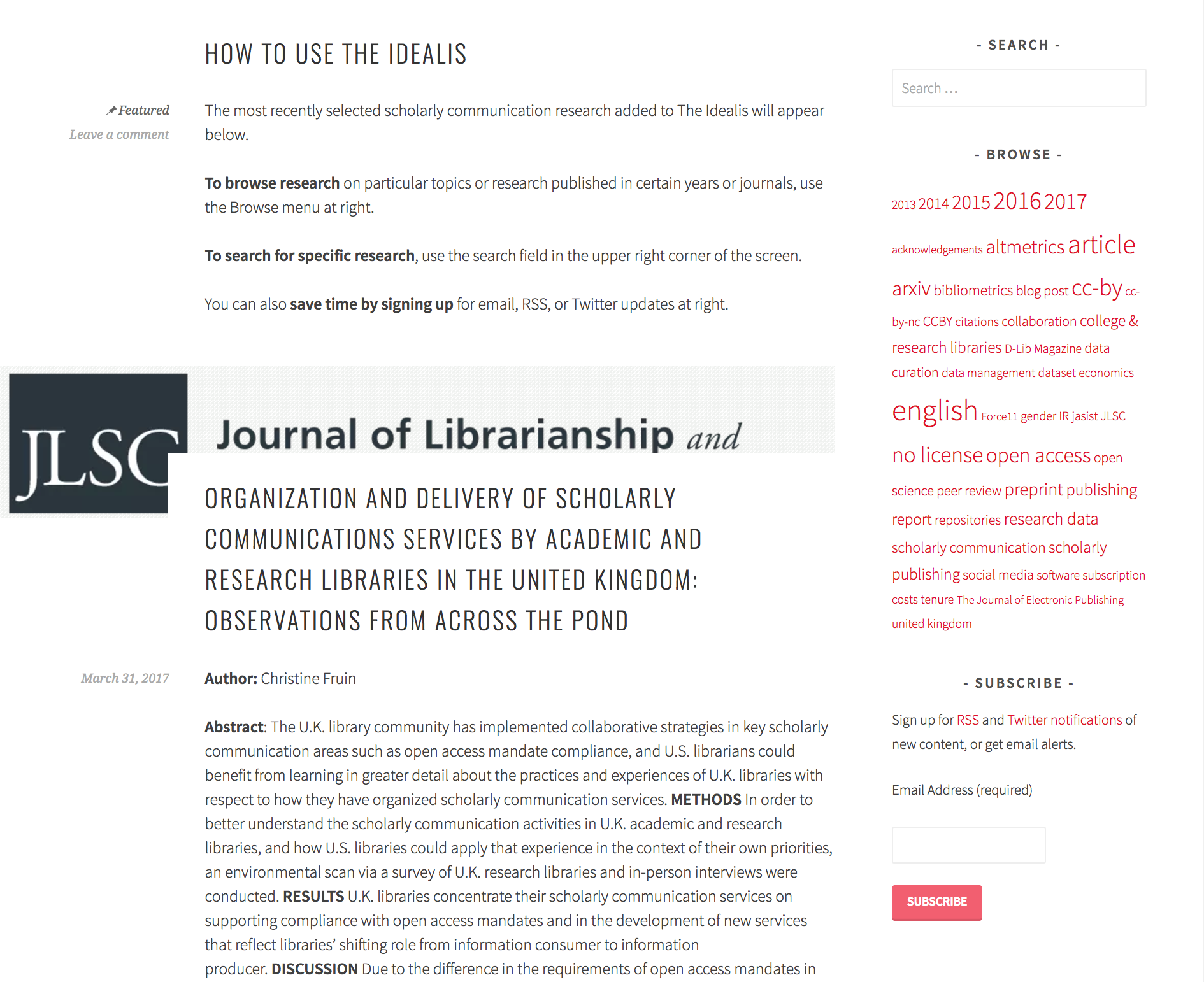
| item listing | | https://theidealis.org/discover/ | - If you need +10% of your vertical space to explain how the interface works, is it a good interface?
- Discovery aids are limited to a search box and a tag cloud
- Each item in the list has an extensive listing, with room for an image/banner per paper.
- Titel, Author, Abstract, Date, Citation and view link to the publisher page are the key metadata being shown.
|
| search results | 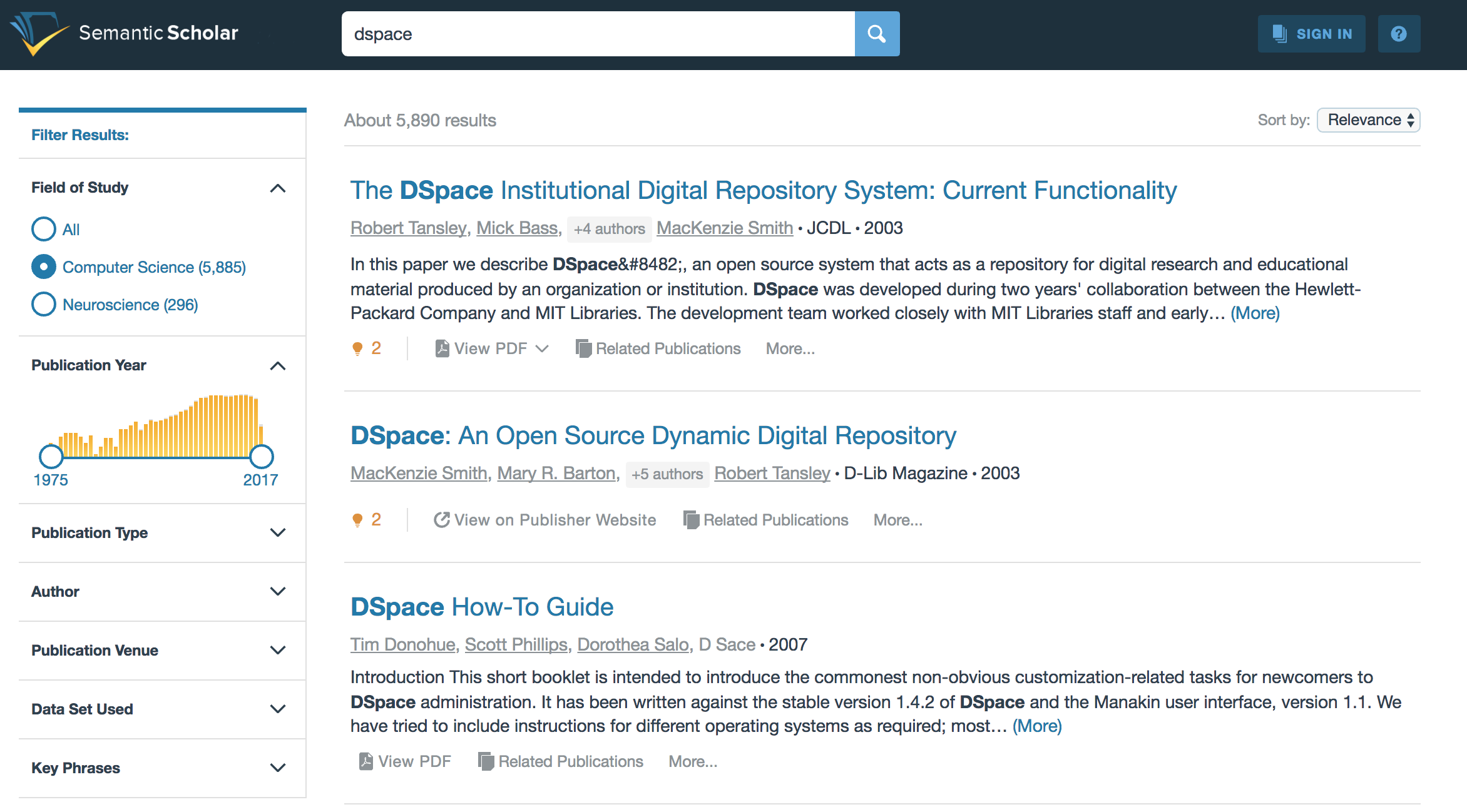 | Semantic Scholar search result list | - Facets fold in. Nice approach to ensure that the list of facets doesn't become too long
- Publication year slider with horizontal bar visualisation of how many results are available per year.
|
| item page | 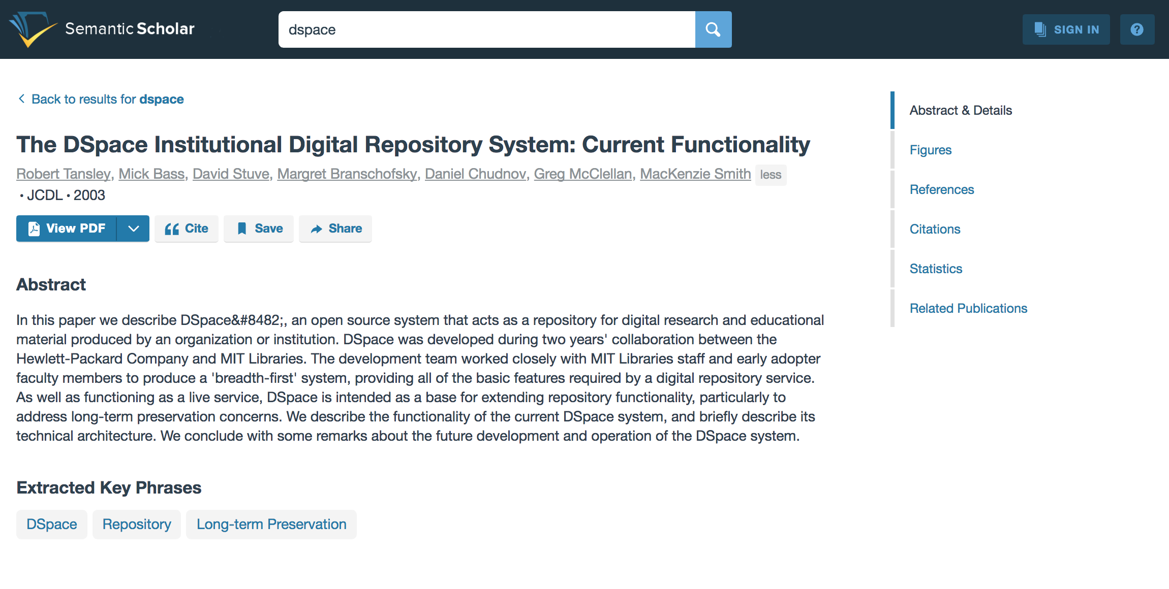 | Semantic Scholar Item page | So much awesomeness don't know where to begin |
| author profile | 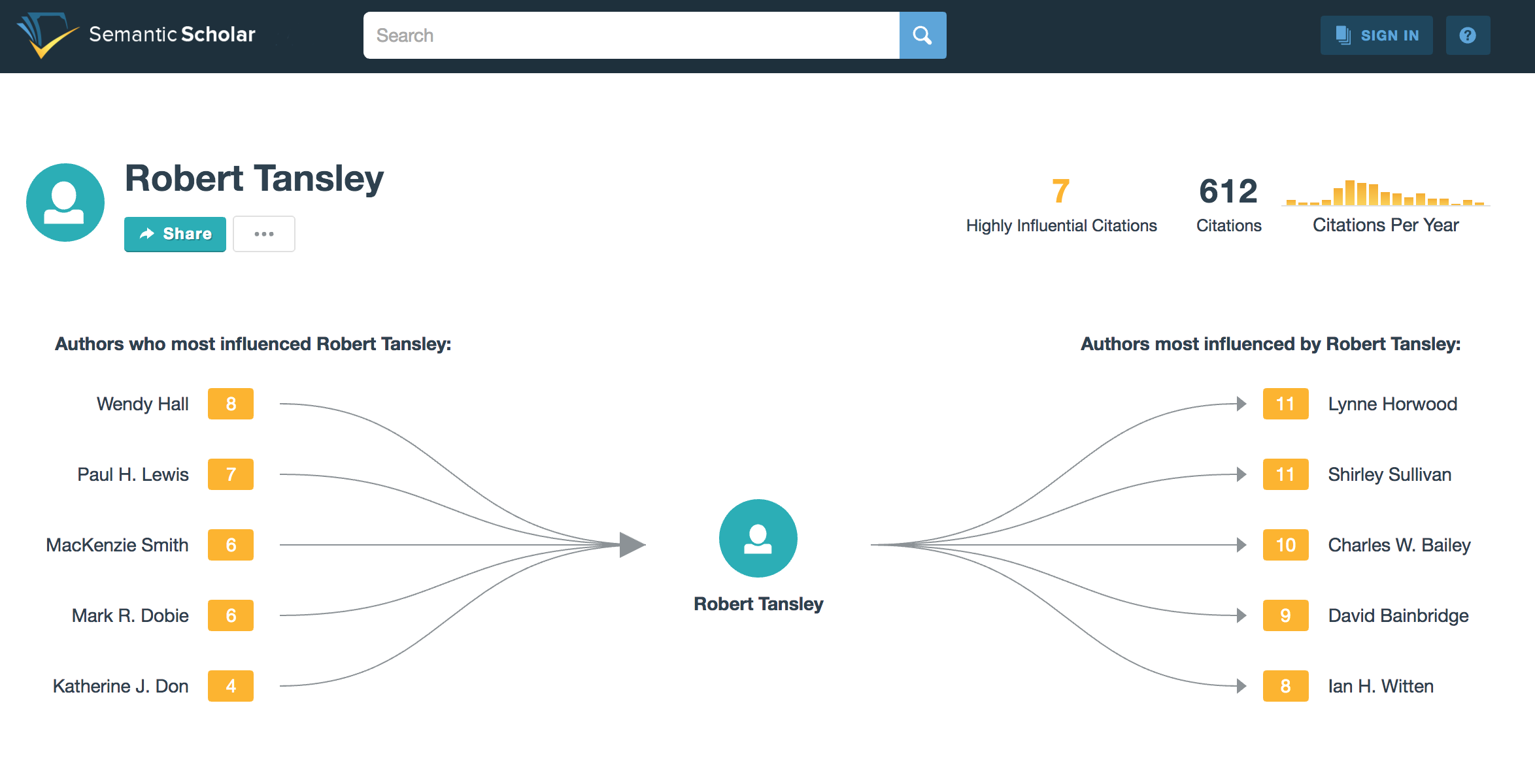 | Semantic Scholar author profile | So much awesomeness don't know where to begin
|
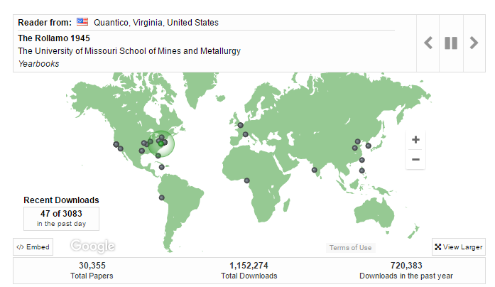
| Felicity Dykas (Missouri) | Home page | | http://scholarsmine.mst.edu/ Digital Commons at Missouri University of Science and Technology | Dynamic map; dots appear to show items being downloaded. Eye-catching. Shows users (and administrators) that this is a site that is being used.
"This map shows recent readership activitiy ..." |
|
|
|
|
|
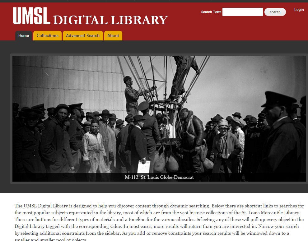
| Felicity Dykas (Missouri) | Home page | | https://dl.mospace.umsystem.edu/umsl/ Islandora at University of Missouri–St. Louis
| Slide show - as an option feature. Knowledge Bank at OSU has this feature: https://kb.osu.edu/dspace/
|
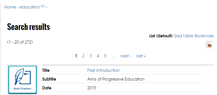
| Felicity Dykas (Missouri) | Search results | | https://ir.uwf.edu/islandora/search/education?type=dismax U of West Florida | Different options for viewing search results: Users get to choose; plus manager can set default. I like how the metadata is displayed in the List view. Clearly labeled and simple. |
| Felicity Dykas (Missouri) | Item page or journal collection page | 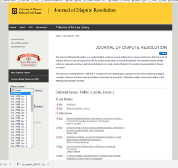 Image Added Image Added
| http://scholarship.law.missouri.edu/jdr/ Digital Commons at University of Missouri Law School
| Like the drop down box from which users can choose an issue. Once an issue is chosen, the pdfs are organized under categories - which vary from issue to issue Examples: - Front matter
- Conferences
- Notes
|
|
|
|
|
|