Contribute to the DSpace Development Fund
The newly established DSpace Development Fund supports the development of new features prioritized by DSpace Governance. For a list of planned features see the fund wiki page.
Table of contents
The goals of this proposal
- reducing clutter on the current search pages
- reconsidering UX choices we made earlier
- e.g. when we first added facetted search to dspace, it wasn't something the average user had a lot of experience with. These days most webshops, search engines, etc. have some form of facetted search.
- making use of the advantages of a javascript UI
- e.g. parts of the page can update without a classic page reload
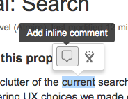
Note: you can make inline comments by selecting a word and hovering over it for a moment:
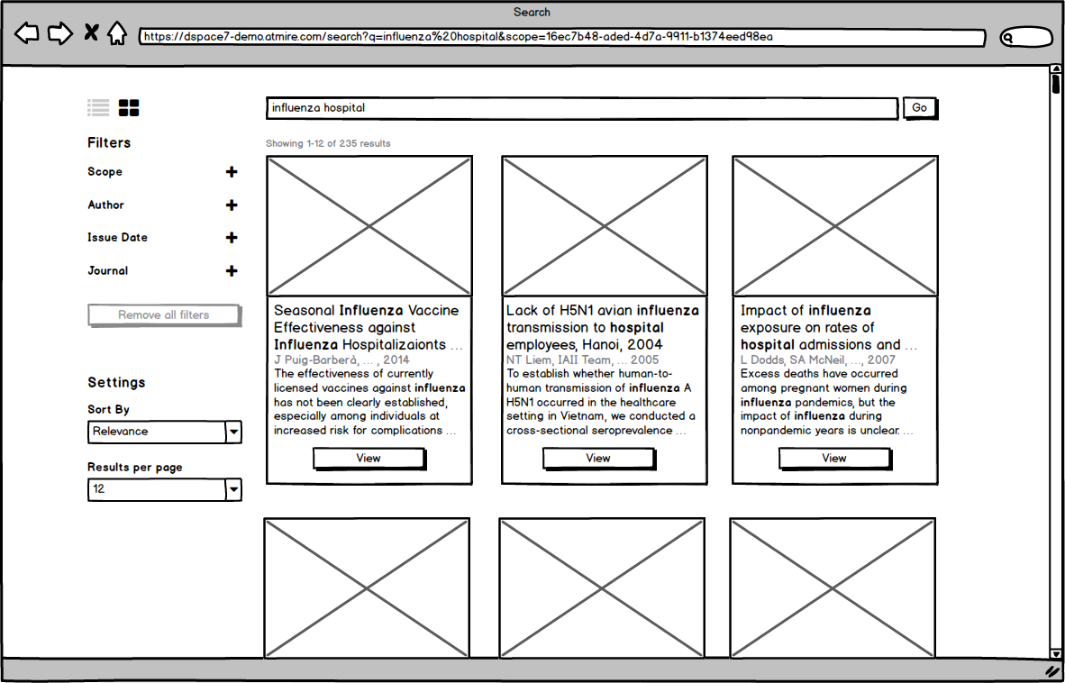
Facets are shown in a sidebar
- That side bar stays fixed, when scrolling
- The design assumes that there will be no navigational sidebar (with sections browse, my account, admin, etc)
- the goal is to move this to a navbar at the top of the screen, but the navigation design needs an entire wiki page to itself
The gear dropdown is removed
- its contents move to the sidebar as well
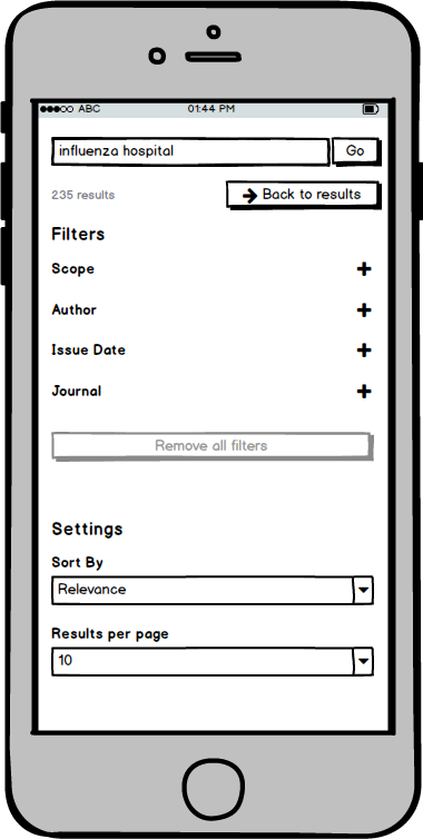
Facets are collapsed by default
- you only see the name of the field
- you need to click that name to open it
- this makes the page seem less convoluted and daunting
- it also makes it easier to use on mobile
- It should still be configurable to have them open by default
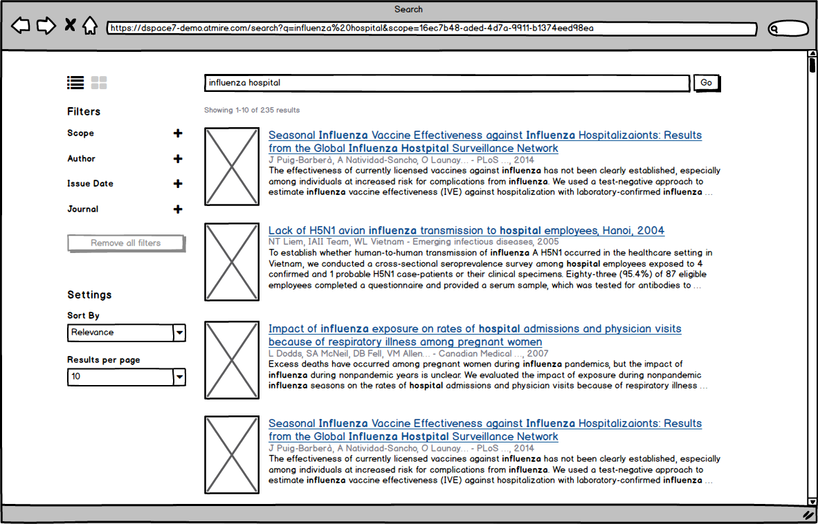

Advanced filters and facets are combined
- A advanced filter input is shown underneath the list of values for a facet
- fields can be configured to have either a facet, an advanced filter, or both
- the order in which the fields appear should be configurable
Active filters are shown in their respective section
- no longer as a tag at the top of the page
- that way, if you want to find a filter on Issue Date, for example, you can go search in the issue date section, where you activated it, rather than at the top of the page.
- although, I am willing to show them at the top of the page as well if people think we should.
Selecting filters
- A facet value is an unchecked checkbox, an active filter is a checked checkbox
- if you select a facet or a filter, the number next to it (showing the number of matching results) disappears
- All selected fiters are applied when they're selected, so that number would always be equal to the number of search results.
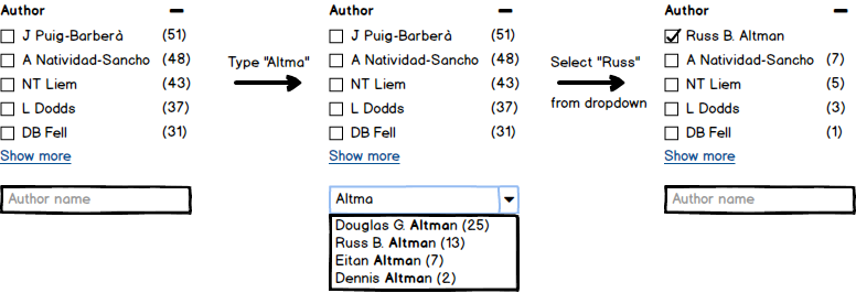
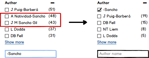
Filter inputs have autocomplete
The equals, contains, not, ID, etc dropdown has been removed
- Currently the same list of options is used everywhere, but doesn't make sense for each field
- It makes the UI look more complicated for novice users
- Even advanced users have to learn to work with it, before they understand exactly what every option means and how it works
- So I propose we remove them, and use a single input with (a subset of) the lucene syntax
- - for 'not'
- `*` is a wildcard
- id:e184785b-bb21-4168-8c43-b0070728a64a
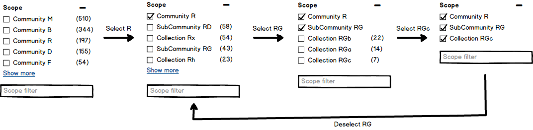
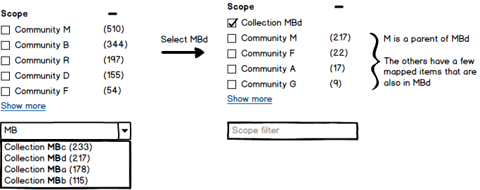
Scope is just another facet/filter
- it's more useful to show scope as a facet, compared to the dropdown we have currently
- You have the most relevant communities at the top
- selecting a community will show its children, the most relevant first, etc
- you also have an autcompleting input at the bottom, to select a specifc community or collection immediately
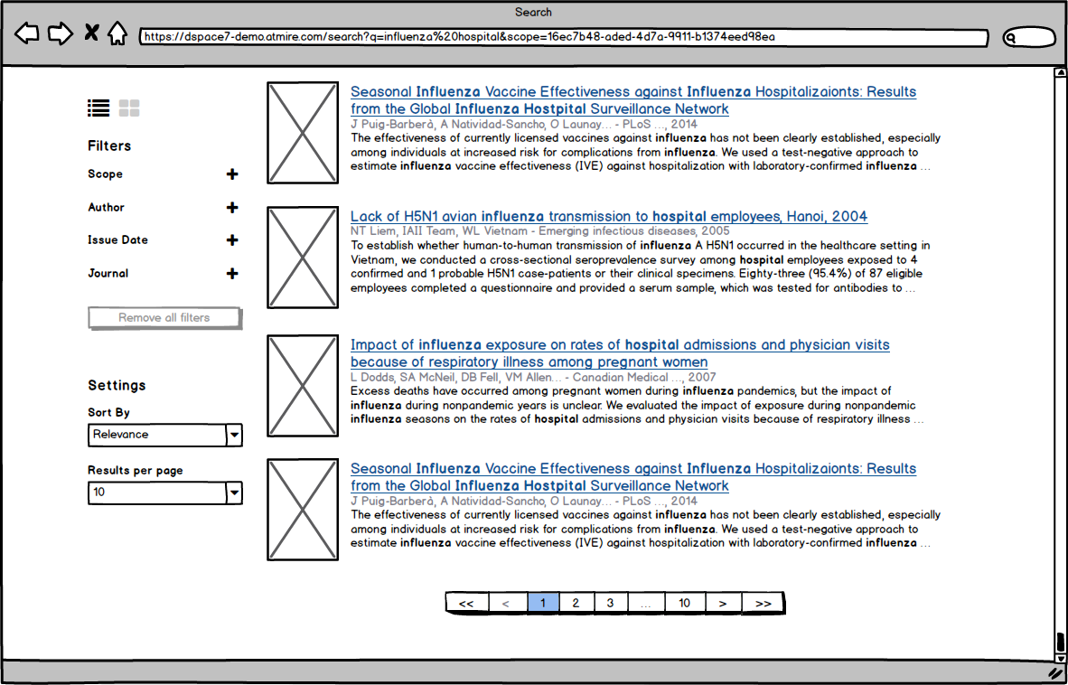
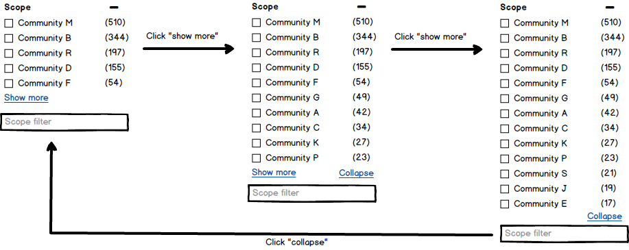
'Show more' happens in place
- the list just gets longer by a page size (e.g. 5)
- if there are more then 10, there's another show more link at the bottom to show the next set, etc.
- if show more is clicked at least once, a collapse link appears next to it
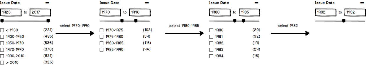
Dates have a dedicated widget
- Show both from and to inputs at the top, and a slider below
- a slider is more useful with a mouse, the inputs are more acurate with a touch screen
- Underneath that divide the total available date range for the repo in to a fixed number of ranges
- If you select a range, the inputs and slider are updated, and a new set of categories for the current range appears
- if you get to a single year, there are no more categories
- categories are shown as checkboxes for consistency with the other filters,
- with this way of working they will never actually get checked, and could be replaced with links
- with this way of working they will never actually get checked, and could be replaced with links
A grid view mode for search results is added
- as way for repositories that have nice thumbnails to showcase them
- a grid of cards
- shortened fields are expanded when clicked
- that’s why there’s a view button, clicking the card doesn’t take you to the result
- clicking the thumbnail will take to the result as well
- if a card expands, the other cards in the row grow with it
- to ensure the grid stays uniform
- 4 cards per row on xl screens, 3 on lg and md, 2 on sm and 1 on xs
- the number of results per page is a multiple of 12 to ensure you have filled rows in most cases
- Both grid and list view can be disabled or made the default.

Overview
Content Tools
All content on the LYRASIS Wiki is licensed under the CC BY (Attribution) license , unless otherwise noted.