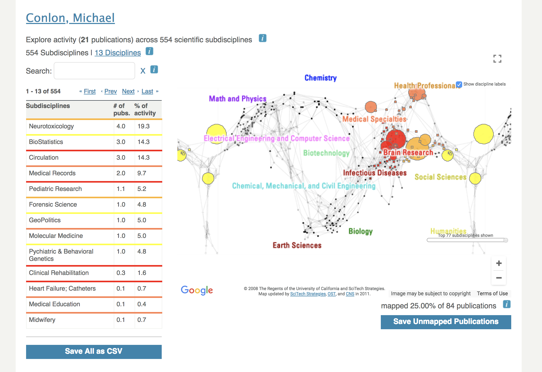
VIVO provides a representation of the research areas of a scholar as a "map of science". The underlying map is fixed, and represents the fields of science as determined by an analysis of more than 1 million journal articles. The size of the bubbles on the map indicates the relative number of papers in that area. The colors indicate the subject areas. The connections on on the map indicate the co-author tendencies of authors in each of the disciples. Disciplines are grouped on the map by co-author tendencies.
The Map of Science determines subject areas by matching publications of the author with journals in which the articles appeared, and using subject areas of the journals. In the lower right of the map we see that the Map of Science has mapped 25% of the author's publications. These publications were in journals whose subject areas are known to the Map of Science.
Overing over bubbles will display the name of the discipline.
Publication counts used by the map of science can be downloaded as a CSV from the panel on the left of the display. Unmapped publication venues can be downloaded from the panel on the right of the display.
