All Versions
- DSpace 7.x (Current Release)
- DSpace 8.x (Unreleased)
- DSpace 6.x (EOL)
- DSpace 5.x (EOL)
- More Versions...
Contribute to the DSpace Development Fund
The newly established DSpace Development Fund supports the development of new features prioritized by DSpace Governance. For a list of planned features see the fund wiki page.
These guidelines help ensure that all DSpace components have a consistent layout and follow the essential Web Content Accessibility Guidelines (WCAG). These guidelines MUST be followed by anyone who wants to contribute to the project. See also our Code Contribution Guidelines
These guidelines apply primarily to the "Base Theme" for the DSpace User Interface.
/src/app/ directories): The primary look & feel of DSpace (e.g. HTML layout, header/footer, etc) is defined by the HTML5 templates under this directory. Each HTML5 template is stored in a subdirectory named for the Angular component where that template is used. The base theme includes very limited styling (CSS, etc), based heavily on default Bootstrap (4.x) styling, and only allowing for minor tweaks to improve accessibility (e.g. default Bootstrap's color scheme does not have sufficient color contrast)/src/themes/custom directories): This directory acts as the scaffolding or template for creating a new custom theme. It provides (empty) Angular components/templates which allow you to change the theme of individual components. Since all files are empty by default, if you enable this theme (without modifying it), it will look identical to the Base Theme./src/themes/dspace directories): This is the default theme for DSpace 7. It is a very simple example theme providing a custom color scheme & homepage on top of the Base Theme.The following terms are used frequently in this page, and this is a quick reference to what we mean by these terms:
The use of the Bootstrap framework can help in achieving some WCAG goals such as ‘Visual Presentation’ (AAA), 'Parsing' (A), ‘Orientation’ (AA), ‘Reflow’ (AA) and ‘Text Spacing’ (AA). See the Bootstrap chapter ‘Accessibility’ for an explanation of WCAG and where to find additional information.
This section provides basic guidelines on User Interface layout/design and the elements (or components) used by the DSpace User Interface. DSpace developers strive to meet these guidelines in order to ensure consistent behavior/layout on all pages. If you find a guideline is not met on a particular page, please report a bug ticket for that user interface page.
All the buttons should have a text description and an icon:
If that it’s not possible (e.g. a small button with an icon) always use the ‘name’ and ‘title’ properties.
Use the tooltip component when you need a better explanation of a button functionality. For example:

For the ‘anchor’ ( the ‘<a>’ element) that uses the ‘btn’ Bootstrap CSS class always use btn-outline-primary.
For the main action button use the Bootstrap CSS class btn-primary.
For buttons like ‘Cancel’ or ‘Back’ use che Bootstrap CSS class btn-outline-secondary.
For buttons that open a dropdown list use the Bootstrap CSS class btn-secondary.
In a button series, or group, only one ‘<button>’ has the Bootstrap CSS class btn-primary.
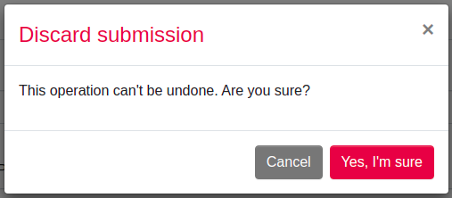
The buttons order, inside a group or a series, should follow the kind of action it performs. At the left side the most ‘light’ action, like ‘Back’ or ‘Cancel’, at the right side the most ‘changing’ action like ‘Delete’ or ‘Remove’. So, the order is:
Back -> Cancel -> Submit/Edit/Save/Save for later/Deposit -> Discard/Delete/Remove
Here an example:

Where possible, align the buttons to the right.
Every macro-function inside a page shall be a primary button.
If, after an action, there is a waiting time, e.g. for the server response, the control (e.g. the button) that launched the action must become disabled and show an animated waiting icon. All other associated controls must be disabled (property ‘disabled=”true”’).
Action confirmation should occur on cancellations or non-reversible operations; a modal should appear with a message giving the possibility to confirm or cancel the requested action:
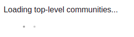
To inform the user that a certain section of the page is about to be modified as a result of an action (e.g. a page change to move forward in a list) it's necessary to make an animated waiting icon appear:
All searches that do not return a result must report their absence via a message within a block (e.g. ‘<div>’) with the Bootstrap CSS class 'alert-info'.
The items in the horizontal top navigation menu are links to pages always available to the user (logged or not).
The items in the left vertical menu are links concerning management, administration and creation or modification of DSpace items. The list can be different according to the permissions of the logged user.
If a page topic has more logical subdivisions, it's opportune to separate them in more tabs (e.g. the 'Edit collection' page where you can edit metadata, roles and policies).
Inside the Extended Footer you can insert information about the institution, partnerships, social links, external links or legal information.
Notifications
All the notifications with the whole page scope should be placed on the top right side of the page, hovering on the elements beneath it:
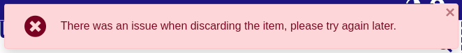
Notifications types and color schemes: the corresponding Bootstrap CSS class must be applied:
Notification type   Boostrap Class   Description
------------------------------------------------------------------------------------------
success             alert-success    to indicate the successful execution of an action
warning             alert-warning    to warn of a possible change to the standard behavior
                                     of some controls (button or action)
info                alert-info       to provide any additional information to the user
                                     (e.g.: no search results)
danger              alert-danger     to inform that an error has occurred
Besides warnings about changes in behaviors, all the notifications must have a closing button to remove them.
The timed notifications are allowed when the notification is purely informational and there is no possibility of interaction (e.g. presence of buttons or forms within the notification).
For the most common actions and alerts, the following free FontAwesome icons are recommended:
Information: fas fa-info-circle
Search     : fas fa-search
Import     : fas fa-file-import
Export     : fas fa-file-export
Add/New    : fas fa-plus
Edit       : fas fa-edit
Save       : fas fa-save
Delete     : fas fa-trash
Cancel     : fas fa-times
Undo       : fas fa-undo
Back       : fas fa-arrow-left

Login      : fas fa-sign-in-alt
Logout : fas fa-sign-out-altThe DSpace User Interface strives to align with WCAG AA criteria. Some AAA criteria may also be supported. For more information see Accessibility documentation.
Here are specific guidelines we strive to follow in the "Base Theme":
Web pages have titles that describe their topic or purpose.
Use the Breadcrumb component on all pages.
Use headers and labels to describe topics or purposes in order to provide support for the user to navigate, find content, and determine his location. Always provide labels or instructions when content requires user input actions, e.g. forms.
Elements have full opening and closing tags, are nested according to their own specifications, contain no duplicate attributes, and all IDs are unique.
Always use ALT properties within the IMAGE tag to describe the content of the images.
The default language setting of each Web page can be determined programmatically with:
<html lang="en">
...
</html>
The text is never justified.
Text, with the exception of subtitles and images containing text, can be resized up to 200 percent without the aid of assistive technologies and without loss of content or functionality.
Use ‘<strong>' elements to emphasize something rather than '<b>’. For example, required fields in a form.
The website operation does not depend on the screen orientation.
To create Web pages that look and feel predictable, components that have the same functionality within a set of Web pages should be uniquely identified. This means, for example, avoiding buttons with similar functions but different descriptions or using similar icons for different functions. Wherever possible, on different pages or different tabs / page sections, place controls in the same position.
ARIA Role, ARIA label and ARIA labelledby: use the ‘aria-label' and 'role’ properties to identify the regions of a page. Ex. to identify two kinds of menu:
<div id="leftnav" role="navigaton" aria-label="Primary">
   ...
</div>
<div id="rightnav" role="navigation" aria-label="Secondary">
   ...
</div>
Other regions of a page can be the header, footer, the page content, etc. Remember that ‘aria-label’ should be used only when there is no other element in the HTML page that can describe better the element itself. In that case use the ‘aria-labelledby’:
<div id="leftnav" role="navigaton" aria-labelledby="menuTitle">
   <h4 id="menuTitle">This is the primary menu</h4>
   ...
</div>
It can be also used on a simple text field to provide a label in a situation where there is no text available for a dedicated label but there is other text on the page that can be used to accurately label the control. Ex.:
<input name="searchText" type="text" aria-labelledby="searchButton">
<input name="searchButton" id="searchButton" type="submit" value="Search">
It’s possible to use them to provide labels to user interface controls (ex.: buttons or inputs in a form).
For all User Interface components, ‘name’ and ‘role’ must be determined programmatically. To do this use:
label elements to associate text labels with form controls
‘aria-labelledby’ and ‘aria-label
Always prefer the following hierarchy of choices when trying to describe topics or purposes:
Plain text with a full description where possible. This will help people with cognitive disabilities who may not immediately know the purpose of the field because the label used by the author is not familiar to them;
Label element;
ARIA label and ARIA labelledby.
Identify programmatically the purpose of the inputs using the guidelines described above and the attribute ‘autocomplete’:
<input id="fname" type="text" autocomplete="given-name" ... >This property is useful to browsers / user agents to identify the content and provide auto-fill capabilities. The values you can use with 'autocomplete' are described here:
Including the text of the visible label as part of the accessible name. When speech recognition software processes speech input and looks for matches, it uses the ‘accessible name' of controls, so it’s important that what the user reads in label or description is, at least partially, what is defined in the ‘accessible name' like ‘aria-label’ or ‘aria-labelledby’. E.g. if a button has a visible value of ‘search’ and its ‘aria-label’ has ‘go’ a problem can occur when the user says 'click Search’ :
<button aria-label="Go">Search</button>So, if you have an ‘accessible name' available, you can expand it using the label text inside it. All of the following examples are valid:
<button>Search</button>
<button aria-label="Search for matches"><i class="fa fa-search"></i></button>

<h4 id="buttonTitle">Search for matches</h4>
<button aria-labelledby="buttonTitle">Search</button>
Order of focus: For example, in a form, use ‘tabindex’ logically (e.g. street number after street name).
Change the color of an element when it receives FOCUS: e.g. CSS can be used to apply a different color when link elements receive focus.
Ensure that the information conveyed by color differences is also available in the text; e.g. links also underlined or mandatory form fields highlighted with an asterisk (*);
Error identification: The element in error is identified and described by text even with client-side controls. Use the property 'aria-invalid=”true”' inside that element. For example, within a form, apply client-side validations to the input fields and make sure that any error message is comprehensive; where possible, suggestions on how to correct the error, should be provided to the user.

All content on the LYRASIS Wiki is licensed under the CC BY (Attribution) license , unless otherwise noted.