
VIVO Documentation
Old Release
This documentation relates to an old version of VIVO, version 1.10.x. Looking for another version? See all documentation.
VIVO offers various possibilities to visualize the contained information. The default visualizations are presented below.
This is described here Using the Capability Map
It is possible to display and investigate co-author and co-investigator networks in VIVO. Both tools share a common structure. The main component is a chord diagram, that is used to visualize the connection betweent co-authors or co-investigators. Note: This information is based solely on publications that have been loaded into the VIVO system. This may only be a small sample of the person's total work.
When you hover above the name of a person, the visualization will focus on showing the connections of the selected person. Furthermore the number of joint publications (or grants) will be shown. Left-clicking on the name will load this person's VIVO profile.
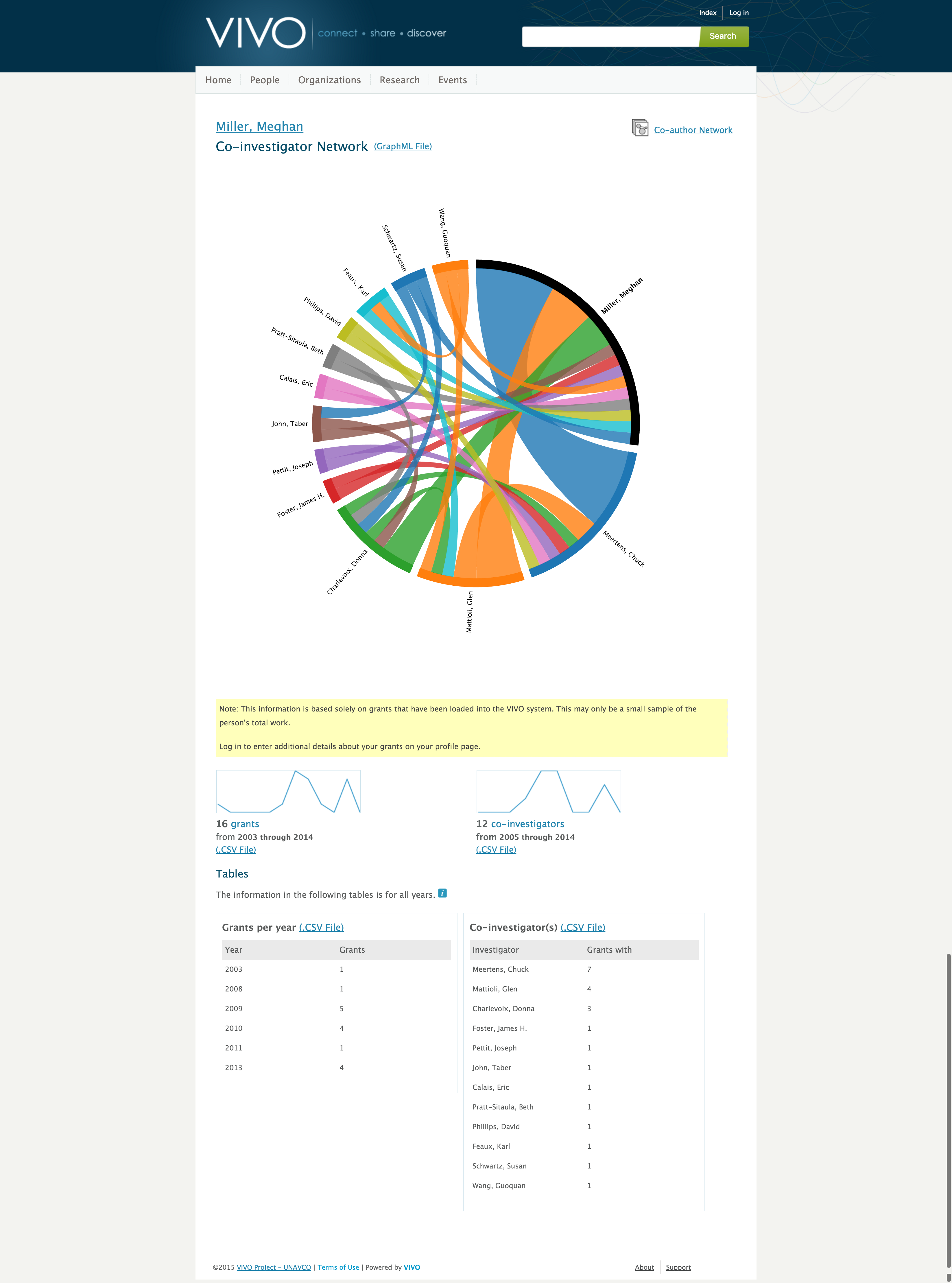
Below the chord diagram you will find more tools. Firstly, two sparklines, one showing the number of publications of this person per year, the other the number of co-authors per year. It is possible to export the underlying data as csv file. Co-authors and publications per year will be shown in tables at the bottom of the page, too.
All content on the LYRASIS Wiki is licensed under the CC BY (Attribution) license![]() , unless otherwise noted.
, unless otherwise noted.